Bibliomania!

April 22, 2014

The Tell-Tale Heart$_57 (2)The Cask of Amontillado

I can try to blame it on the fantastic blog 50 Watts, or on this fine exhibit at The Morganbut in fact, it’s all on me:  I’ve loved books with woodcuts since I was a boy, and I recently went on a bit of a spree getting illustrated and limited editions of a few of my literary favorites.  None of them are particularly valuable, but all are, as they say, “collectible“.

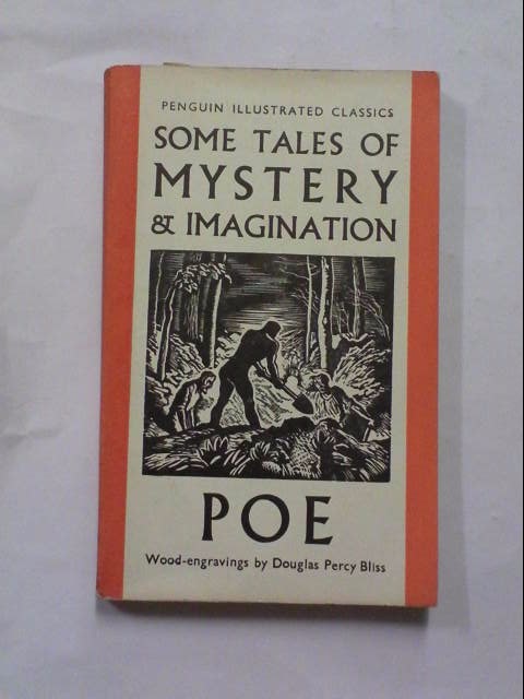
Above, is an edition of Poe’s tales that was issued in the 1940s, although I recall these images from a library book, perhaps a reprint, when I was in school.  The book is in great condition, and I re-papered the tattered slipcase, one of my new hobbies.  I love that Fortunato and Montresor!

This collection of Poe stories (remember the old song from Mad Magazine?) is part of a series of woodcut-illustrated classics published in paperback by Penguin Books, and featured in the Morgan exhibition.  Found it online, but it has not arrived in the mail yet.

image1

Of course, when it comes to Poe, my favorite, after Amontillado, and distiguished by being his only novel, is the Adventures of Arthur Gordon Pym.  I bought a few editions in French, all translated by Charles Baudelaire, who introduced Poe to France in the 1850s.  This is a nicely illustrated copy from the 1970s.

10324066187 10324066187_2

And here is a first edition of Pym’s Adventures, first edition in French, that is, published in 1858.  Why is it that the French were so far ahead of everyone else when it comes to paperbacks?  The book on the mantle of this well-known painting by Magritte is Arthur Gordon Pym, although I can’t make out the date.

$_12 (1)Reproduction Prohibited

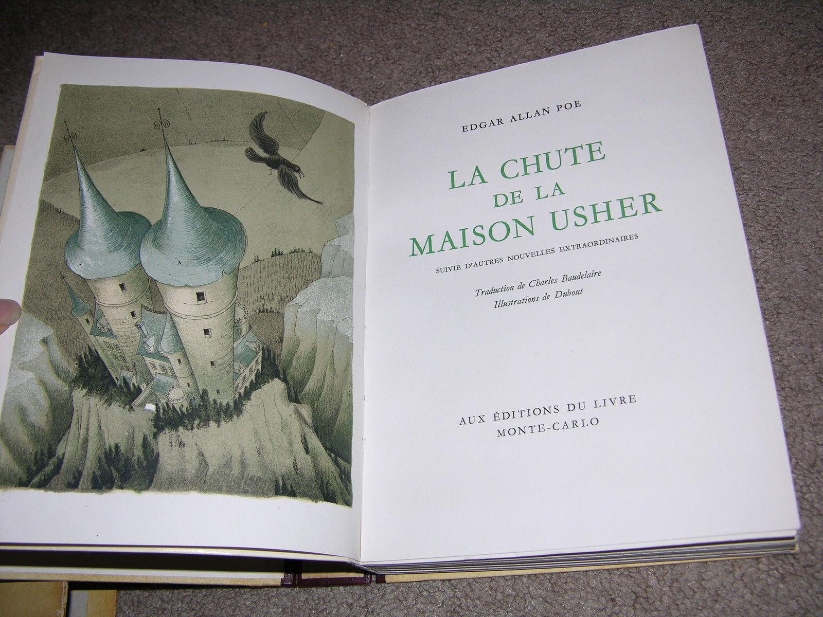
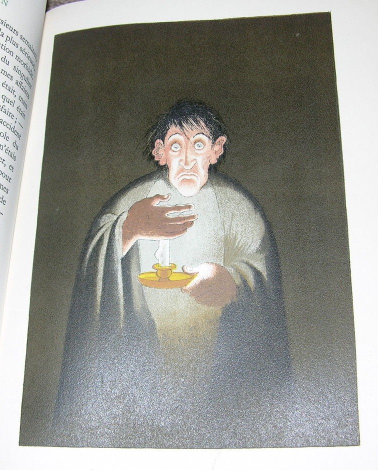
Finishing with Poe, I got this selection of tales, again in French, because I liked the wonderful lithographic illustrations.

$(KGrHqRHJBQE8e25Stv0BPP4YE!t)g~~60_57 $(KGrHqRHJBIE8e0EUlkcBPP4YObR!Q~~60_57

Done with Poe!  Candide is one of my all-time favorite books, so I have many copies of it, including a variety of cheap paperpacks, but I decided to upgrade my collection.  This French edition is illustrated by the Italian Umberto Brunelleschi using stencils, or pochoirs.  It was published in the 1930s – quite a racy little paperback.

cadide

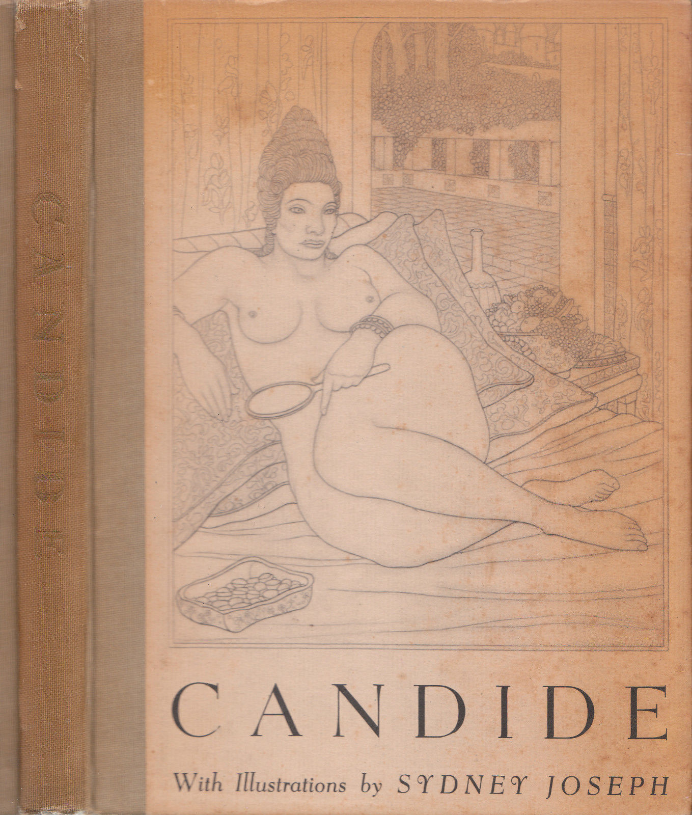
Back to woodcuts with this 1920s edition, also heavy on the erotic aspect, as is par for the course with Candide, and why not!

$_57 (3)  $_57 (4)

Not in the greatest condition, this one, but it was cheap, and get a load of that volupté

$(KGrHqFHJFIFEFp)BrwUBREw!ILgow~~60_57 $(KGrHqNHJE!FEN1l02ggBREw!ZLrDQ~~60_57

And a tiny little softcover edition from the 1920s, complete with woodcut illustrations and vignettes.  Did I mention that one of my Internet passwords is Pangloss?

$_57 (5)

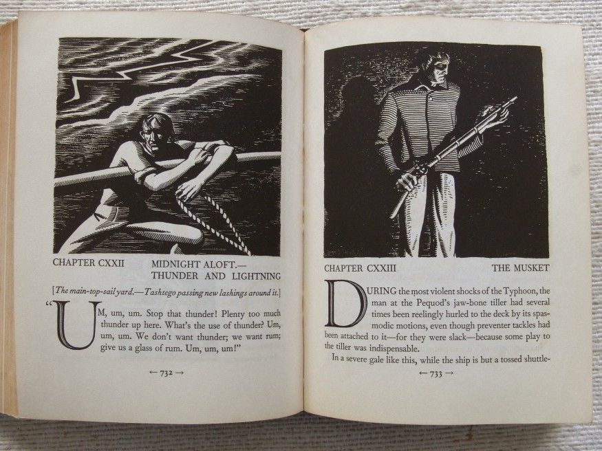
I have a few editions of Candide with illustrations by Rockwell Kent – it was such a popular production that it was issued several times in different formats, but I had never even seen a copy of the Kent Moby Dick.  (I read that it was a big deal that Melville’s name wasn’t on the cover, as if you needed it!)  This Random House edition from 1930 is the first reissue of the Kent illustrated version, originally published in a very limited three-volume set.  (There is also a fancy gold and blue covered version of this book from 1933.)  Kent’s pictures are fantastic, but they are ink drawings, not woodcut prints, although they are almost always referred to as such.

$_12

$_57

$_57 (1)

I like Barry Moser’s art work a lot, and I have a few trade editions of his books – Alice in Wonderland, Frankenstein – so I figured I should get a copy of his Moby Dick.  It’s often cited as a superlative example of book design and production, and the original letterpress edition goes for many thousands of dollars:  I settled for the hardcover University of California reprint.  I like it, but it just doesn’t excite me the way Rockwell Kent’s does.

9780520045484 moser-whales 2011-01-MobyDick-240241

And while I was on this Herman Melville theme, I read this book about the slave trade, by a local historian.  The facts of the trade are unspeakably appalling, a veritable holocaust that played out over centuries.  Even the language of the traders is similar to what we know of Nazi organizers of the death camps:  the main difference was that slaves were expected to reproduce, rather than simply work themselves to death.  One of the benefits of a pre-industrial age.

download

It’s a discussion of the Atlantic slave trade, using Melville’s novella, Benito Cereno, as unifying narrative device for the history.  Until I read this book, I had thought that Melville based his story on facts from the Amistad case, but actually, there really was a Captain Delano!  He was an ancestor of FDR, and quite a few other people as well, and he was involved in the slave trade himself, fine old New Englander that he was.  The story is based on his memoir which recounts in detail his encounter with the historical Don Benito.  I purchased this limited edition illustrated edition of Benito Cereno with woodcuts by Derrick Palmer, published by the Imprint Society.

The pictures below show Delano being rowed to the captive slave ship, and Babu’s head on a pike, after the truth has been revealed.

photo_44477_carousel Benito-Cereno-Head


Astolfo retrieves his wits: Orlando Part II

October 4, 2011

Some months ago I put aside Orlando Furioso after completing the first of two volumes in the Barbara Reynolds translation.  Now I have returned to the fray!

As usual, it’s a crazy, exhilarating, bizarre cascade of satire, wit, romance, adventure, and, yes, poetry.  Orlando is furioso because he’s mad.  Since he’s the main man in Charlemagne’s effort to drive the Moslems-Saracens-Africans from France (in the region where I just happened to have been vacationing in August) his mental incapacitation is most inconvenient.  Not to mention the fact that he kills anyone in sight, friend or foe, and all for being jilted by a woman.

His comrade at arms, Astolfo, makes a trip to the moon on a chariot, and finds that it is not made of green cheese, but is an enormous garbage dump of sorts where everything that is lost on earth ends up.  While there, he is given some tips on how to find stuff by Saint John, author of the Book of Revelation.  Sure enough, Orlando lost his wits, and there they are on the moon!  Astolfo gathers up the vial to bring them home and restore Orlando to his fighting best, but not before he notices some of his own  wits – he didn’t know he had lost them, but then, who does? – and snorts them up his nose to restore himself to full mental capacity.

While searching for illustrations of the poem, I came across this wonderful drawing of Astolfo on the lunar dump by Davide Bignotti.  Unfortunately, this is the only picture from Orlando that he has posted.  I think it conveys the wackiness of much of the poem – it reminds me of Italo Calvino too.

Gustave Dore did a set of illustrations for the poem (is there any classic he didn’t illustrate?)  They seem a little stuffy after reading the text.

Here is the poem – Canto XXXIV, 83-84

A liquid, thin and clear, Astolfo sees,
Distilled in many vases, large and small,
Which must (so volatile the fluid is)
Be tightly corked: the largest of them all
Contains the greatest of those essences:
The mind of mad Anglante, of whose fall
You are aware and of his frenzied fits.
And on it the duke read: ‘Orland’s wits’.

On other bottles too the names are shown
To whom the wits belong.  To his surprise,
Astolfo finds a great part of his own;
And more astonished still, before his eyes
He sees the wits of those he thought had none.
But this his first impression verifies:
That little wit they must retain down here
If such a quantity is found up there. 


How I Learned to Stop Worrying…

March 15, 2011

and Love the Bomb!  Also known as Dr. Strangelove.

That’s Hannah Dundee gazing at Fat Man, one of the A-bombs dropped on Japan.   Hannah inhabits Xenozoic Tales, comic book adventure series written and drawn by Mark Schultz, who carries on the tradition of Hal Foster (Prince Valiant), E.R. Borroughs (Tarzan) and other old-fashioned comic-pulp storytellers.  The macho hero is Jack Terenc, a shaman of sorts who tries to keep civilization in balance with nature so that The Great Cataclysm is not repeated.  Meanwhile, he and Hannah have multiple adventures in a world that mixes dinosaurs and nitro-fueled 1950s Cadillacs. 

It’s fun, and more clever than it may sound to you.  The back-cover image at top is a perfect example of the mélange of styles and influences in the artwork:  fashion photography; cheesecake; academic life studies; art deco; Hollywood movies;  Decadent/Symbolist art; adventure comics; Gothic horror… some call it kitsch.

And while we are musing over Japan, atomic desolation, meltdowns, and general human evil, you may enjoy this riff on bombs, bombing, and movies.  You can follow all the links – have fun.

Here’s the front cover:


A few of my favorite things…

January 25, 2010

See what my new reproduction of the illustrations from Martin Luther’s translation of the Bible has to offer!

  • Apocalyptic rhetoric – in this case, the real deal, the Book of Revelation
  • Reptiles – here we have the Beast from the Pit looking like a Komodo Dragon
  • Architecture – John measures the heavenly temple
  • No-holds-barred satire – The lizard wears the Pope’s hat!
  • Bob Dylan? – Whoa, two witnesses with tongues of fire.  Swear that’s in one of his songs somewhere!

[Feb. 13]  Could it be that this dragon image from Hypnerotomachia Poliphili could be the source of the iconography in the image at the head of this post?  A dragon/lizard in the cathedral/temple?  How odd that would be as a source of Protestant anti-papal graphics!


Jim Woodring and …

October 18, 2008

Jim Woodring is the latest comics artist to come to my enthusiastic attention.  Though he no longer does comic strips, he is legendary for his color and black and white stories about Jim – autobiographical I guess – and Frank, a humanoid figure who wordlessly moves through a landscape that exceeds the bounds of  the surreal.  In fact, to use that term, “surreal,” to describe him is to sink to cliche.  His stories of Frank are dreamlike and terrifying, but in a way that lacks the self-conscious arti-ness of so much surrealism, while being no less powerful.  I’d say, his images smack more of what I have experienced in my rare spells of delirium, but his stories all make sense, often moral sense.

The color page below will give you an idea of the eerie weirdness and humor that “Frank” brings to the world.  You can visit this link to see a faithful animation of his Frank character, but I think I like the regular old ink-on-page comics better.

The black and white page is from an issue of his “Jim” comics, and as usual, it is more structured along the lines of a wordy narrative…but of course, there is that giant talking frog!  I love this story for its wit, subtlety, irony, and sly philosophy.  It reminds me a lot of Italo Calvino’s story, “The Aquatic Uncle.”  The mastery of tone in this page, keeping to a steady highminded satire while portraying a sexy “girl-form,” a pompous and sensitive frog…prince? philosopher? demon?…and a tense socratic dialog on fear and human potential is amazing.  BRAVO!

…and gore…

Yes, somewhere there is a graduate student laboring on a Ph.D. dissertation on the comparative treatment of gore in Richard Sala, Tony Millionaire (two other of my favorites) and Woodring.  Consider first, Richard Sala:

His “noir”, Edgar A. Poe-esque adventure stories are filled with hacking, stabbing, decapitation, skull crushing violence.  Still, it evinces a laugh because he works within a genre and its anti-universe, always keeping it at a considerable emotional distance from us.  When I see those knives flashing, or helter-skelter piles of semi-clothed dead maidens…I chuckle or leer.

Tony Millionaire goes for the grand guignol, with a devilishly funny twist.  He’s not trying to scare us out of our seats.  More likely, he’d like to get us up and running to the can to vomit in disgust,

maakies_worms2a

even as we nearly choke for laughing.  When I look at his sliced up bodies (Everything always seems to grow back fine for the next page!) and buckets of throw-up, I grimace with disgust and chortle.

Then there’s Jim Woodring.  His violence is cool, often wordless and soundless.  Sometimes we don’t even know what is devouring or mutilating what.  Sometimes, however, it’s just straight out barbarity, but with no visual change in tone from the other actions.  Consider below:  Manhog observes Frank having a picnic with his dolls and grows distraught at his exclusion from the fun.  He rushes in and upends Frank’s picnic spread and runs off.

Later, Frank walks alone, despondent, but he happens on the debauched Manhog sleeping.  Watch him take revenge!

Is there any more clinical depiction of the savagery of human violence?  It is truly disturbing, distilled to its terrible essence by the magic of the strange, ridiculous incongruity of the cartoon format.


Maakies Ahoy!

March 30, 2008

maakies_hdr.jpg

I am always on the lookout for sources of new stimulation, literary and visual. Sometimes this means I stumble on something that has been around for a while without my knowing about it. So it is with the comics of Tony Millionaire. He is known not so much for “graphic novels” as for a syndicated comic strip, “Maakies” that I am sure that I have seen many times – I don’t know where – and for which I now have an intense enthusiasm after reading his latest book of collected strips.

Millionaire (presumably a pen name, though he has denied it) has a style that is rich and detailed. His landscapes recall to my mind those of R. Crumb, though their style is otherwise very different. They do share an intense dedication to the possibilities of black and white ink line work and to exploiting control and detail. I also think of Windsor Mckay (Little Nemo and Dreams of a Rarebit Fiend). Another illustrator, one of my favorites, W. Heath Robinson, comes to mind, but in a recent email exchange with Millionaire, he said he’d never heard of Robinson. (“Is he funny?” he asked.)

Maakies (why the name, I dunno) is very funny, absurd, wierd, extremely vulgar, sometimes scatological…I could go on. It also veers into the literary and metaphysical with bizarre wit. I frequently exploded in laughter to tears on reading some of the strips in “With the Wrinkled Knees,” the new collection. The ones I read mostly featured a perpetually drunken crow (Drinky Crow) that seems like Heckel or Jekyll on a bender, and his Uncle Gabby, a mentally deviant (Irish?) monkey. Many of the strips play out in a nautical setting that seems lifted from hallucinations induced by 19th century searfaring stories – Melville’s “Benito Cereno”, Poe’s “Arthur Gordon Pym”, and London’s “Sea Wolf” come to mind, but you need to imagine them through the fog of psychosis or radical inebriation.

Click on the strips below to see a full-size image –

Philosophical Maakies:

Philosophic Maakies

Nautical Phantasy Maakies:

Airship Maakies

Surreal Maakies:

Surrealist Maakies

Escapist Maakies:

Literary Drug Maakies

These strips bring up an arcane association in my mind, the 19th century novel, Atar Gull, by Eugene Sue. That story shared a nautical setting with Maakies, and it was about Gull, a captured African being transported to the slave market and his subsequent escape and adventures. The slave captain is a total opium addict – in fact, so deep is his addiction that he believes his opium dreams to be reality, and he is certain that the hellish life on board the slave ship is simply his bad dreams.